Richer input and navigation
SwiftUI forms: Slider
Learn how to use the Slider control in SwiftUI to let users drag to pick a value, setting its value, in range, and step parameters to control the range.
The Slider control shows a bar with a knob. The user drags it left or right to decrease or increase a value. Volume and brightness in Control Center are sliders.
We create one with 3 parameters: value, in, and step:
@State private var age: Double = 0

//...

Slider(value: $age, in: 0...100, step: 1)
value is a binding to the property that holds the current position. Like every form control, the slider writes into it as the user drags.
in sets the minimum and maximum. Here the knob can’t go below 0 or above 100.
step is how much the value moves at a time. With 1 we go from 0 to 1 to 2 and so on. You could use 10, or 0.2, whatever fits the data. Leave step out and the slider moves continuously, with all the decimals in between.
Notice the type of age. Slider works with a Double, so the property has to be one. If you declare @State private var age = 0, Swift infers an Int and the slider won’t accept the binding. That type annotation is not optional.
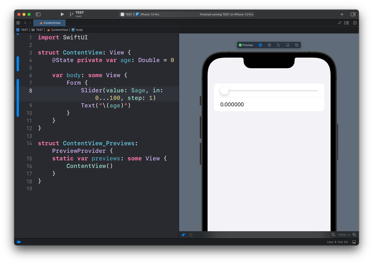
Here’s a full example:
struct ContentView: View {
    @State private var age: Double = 0

    var body: some View {
        Form {
            Slider(value: $age, in: 0...100, step: 1)
            Text("\(age)")
        }
    }
}
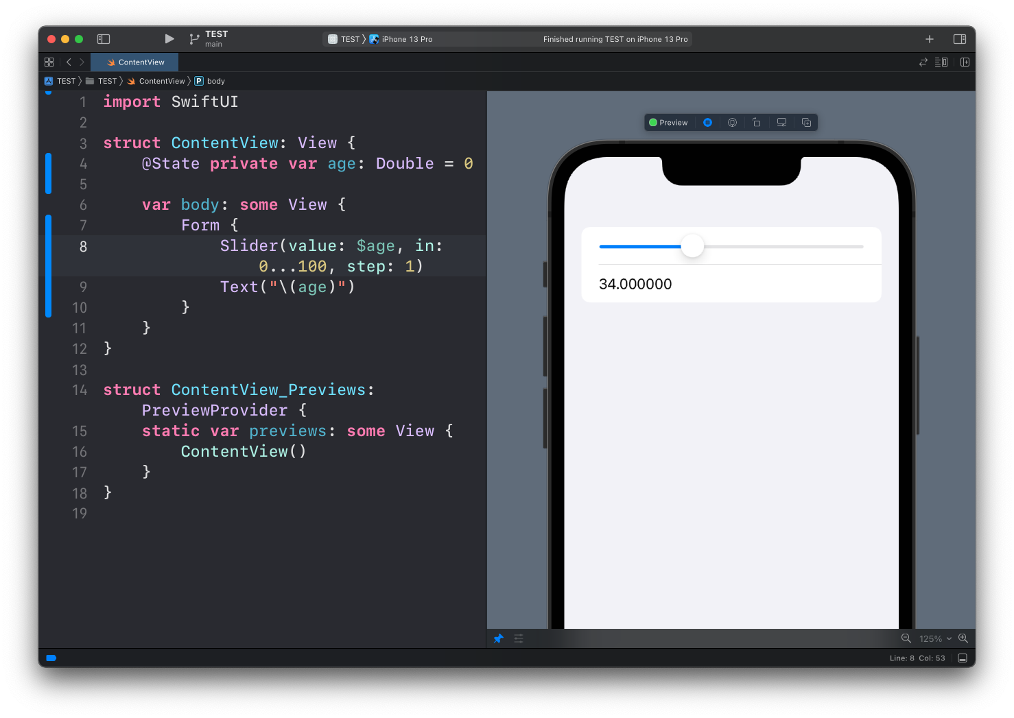
I added a Text view under the slider to show the value of age. Drag the knob and the number follows it in real time. That’s the @State binding at work, same as with the Toggle and the TextField.
Since age is a Double, we get a lot of decimals: 34.000000. Not pretty. We could format that, but it’s a topic of its own, and I cover it in formatting decimals in a Text view. The short version: Text("\(age, specifier: "%.0f")") prints 34.
Labels
Notice the slider has no label. Unlike Toggle or Stepper, the basic initializer doesn’t take one. If you want text at the two ends of the bar, use the initializer with minimumValueLabel and maximumValueLabel:
Slider(value: $age, in: 0...100, step: 1) {
    Text("Age")
} minimumValueLabel: {
    Text("0")
} maximumValueLabel: {
    Text("100")
}
The first closure is the accessibility label, read by VoiceOver but not drawn on iOS. The other two appear at the ends of the bar.
Sliders are for values where roughly right is fine, like volume. When the exact number matters, the Stepper in the next lesson is a better fit.
Lesson completed