Collections and layout
SwiftUI: the List view
Learn how to use the List view in SwiftUI to show data in rows, group items with the Section view, and change its look with the listStyle modifier.
The List view is one of the views you’ll use most in SwiftUI. Settings, Mail, Notes, Contacts: they are all lists.
You declare it like a stack, with a closure:
List {

}
Inside, you put a series of views. Let’s start with a single Text:
List {
    Text("One")
}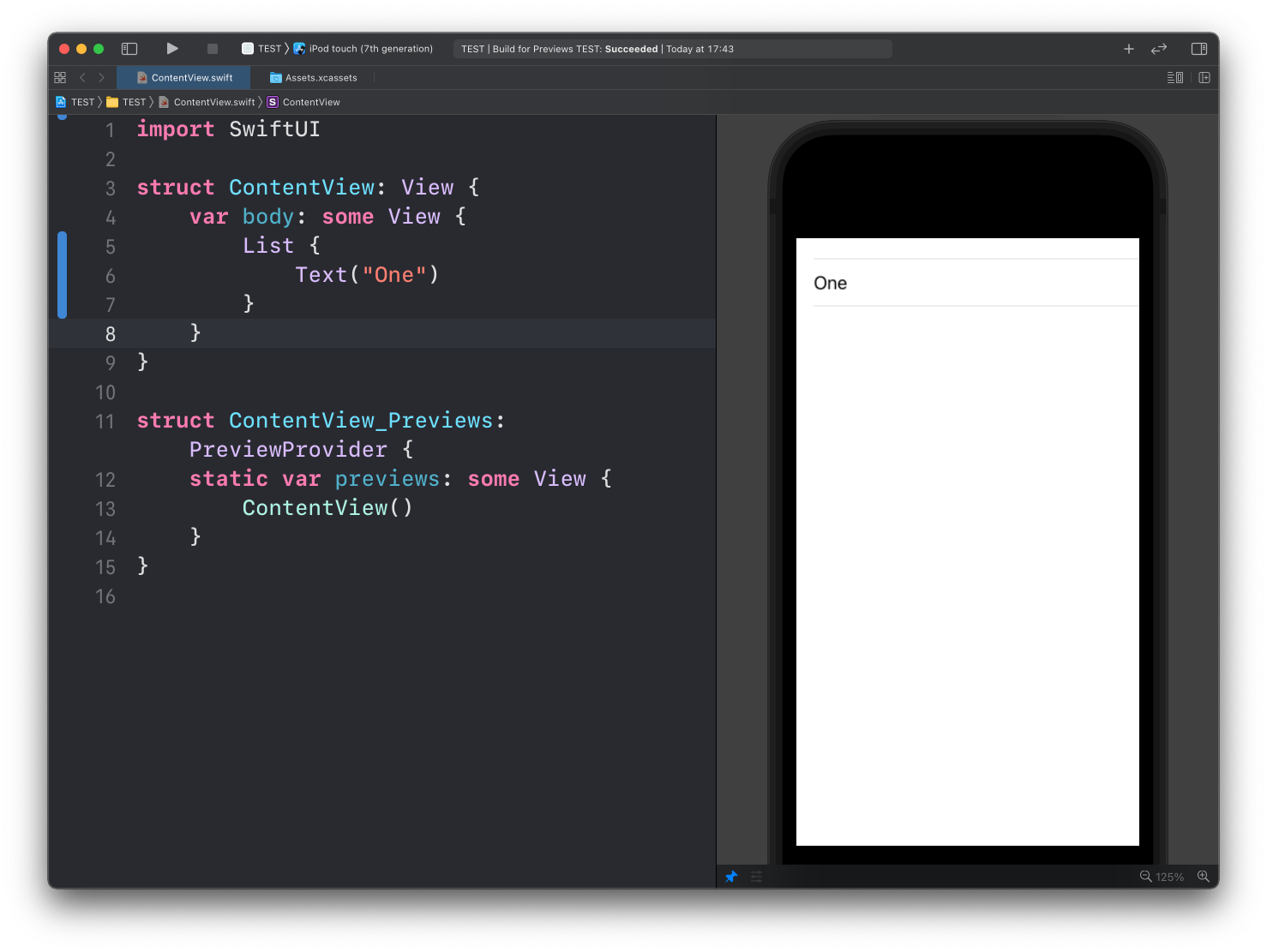
See? List takes the Text child and puts it inside a row, with the separator lines you know from every iOS app.
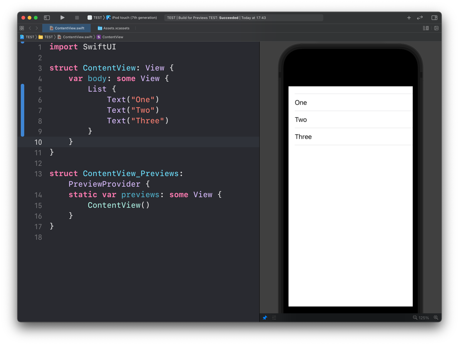
Add more children and each one gets its own row:
List {
    Text("One")
    Text("Two")
    Text("Three")
}
A list scrolls on its own when the rows don’t fit the screen. You don’t wrap it in anything.
Sections
Inside a list you can group rows with the Section view. Each section can have a header:
List {
    Section(header: Text("First 2")) {
        Text("One")
        Text("Two")
    }
    Section(header: Text("Others")) {
        Text("Three")
    }
}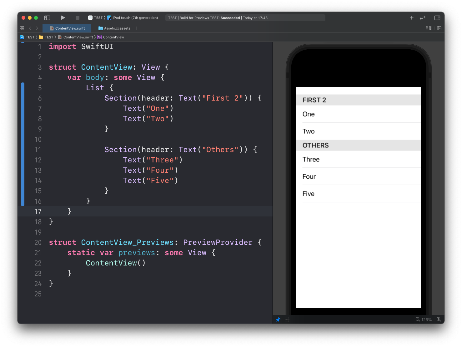
The header text shows up above the group, in small capitals, like the section titles in the Settings app.
List styles
The listStyle() modifier changes how the list looks. The built-in styles are:
InsetGroupedListStyleInsetListStyleSidebarListStyleGroupedListStylePlainListStyle
Here’s InsetGroupedListStyle, which is what the Settings app uses:
List {
		//...
}.listStyle(InsetGroupedListStyle())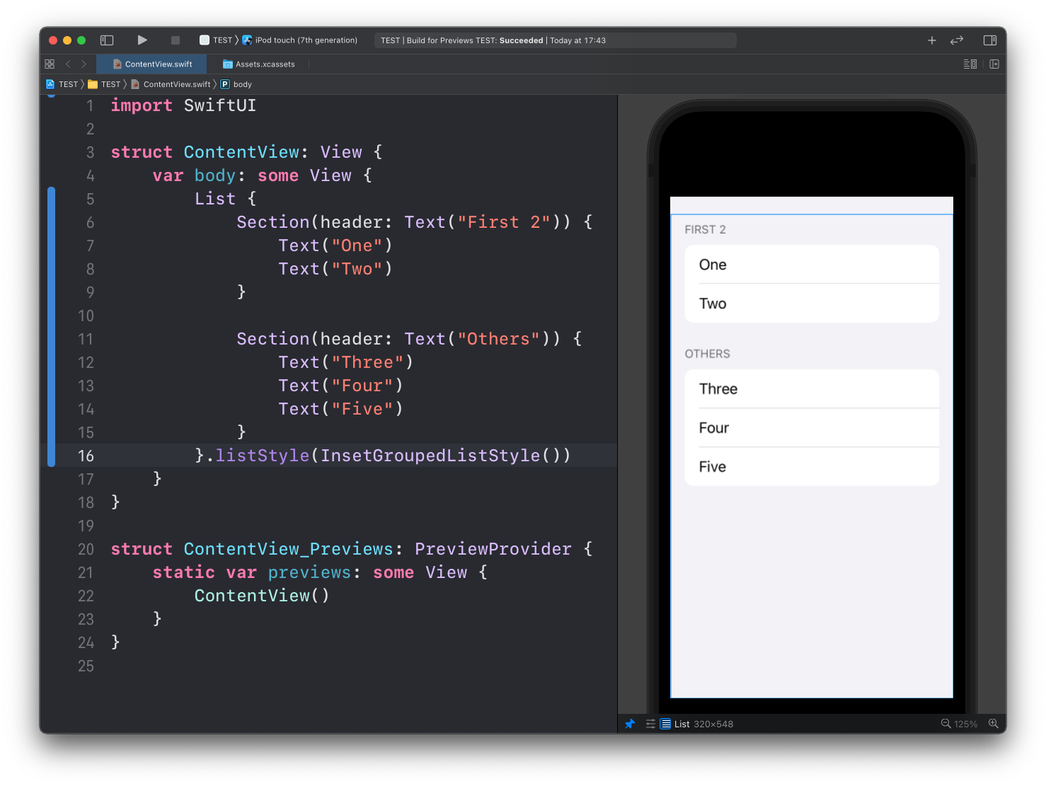
The sections become rounded cards, inset from the screen edges.
And here’s GroupedListStyle:
List {
		//...
}.listStyle(GroupedListStyle())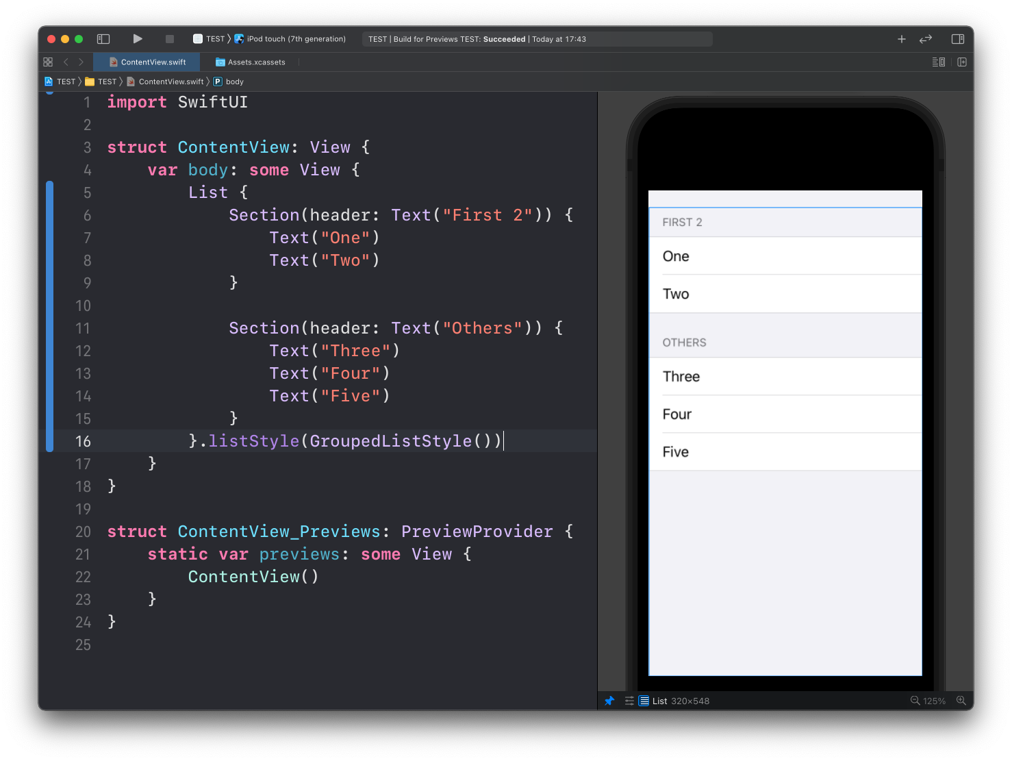
Same grouping, but the rows run edge to edge.
Here’s SidebarListStyle. Notice the sections are now collapsible, with a chevron next to each header:
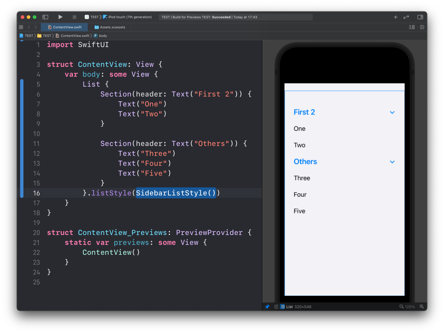
My advice is to leave the default style unless you have a reason to change it. The default is what the platform expects, and it changes with each OS release so your app keeps looking current for free.
Lesson completed