Richer input and navigation
SwiftUI forms: DatePicker
Learn how to use the DatePicker control in SwiftUI to let users pick a date and time, and how displayedComponents limits it to just the date or time.
The DatePicker control lets the user pick a date, a time, or both. It’s the same picker you get when you set an alarm or add a calendar event.
How does it work?
Like every form control, it needs a property to write into. This time the type is Date:
@State private var dateChosen = Date()Date() with no arguments is the current moment, so the picker starts on today.
We use
@Stateso theDatePickercan change this value.
Then we link that property to the DatePicker:
DatePicker(selection: $dateChosen, in: ...Date()) {
    Text("Pick a date and time")
}
The closure is the label. The in parameter is a range of allowed dates. ...Date() is a one-sided range that means “anything up to now”, so the user can’t pick a future date. That’s what you want for a birthday or a purchase date. Drop the parameter to allow any date, or use Date()... to allow only future dates.
Here’s how it looks:
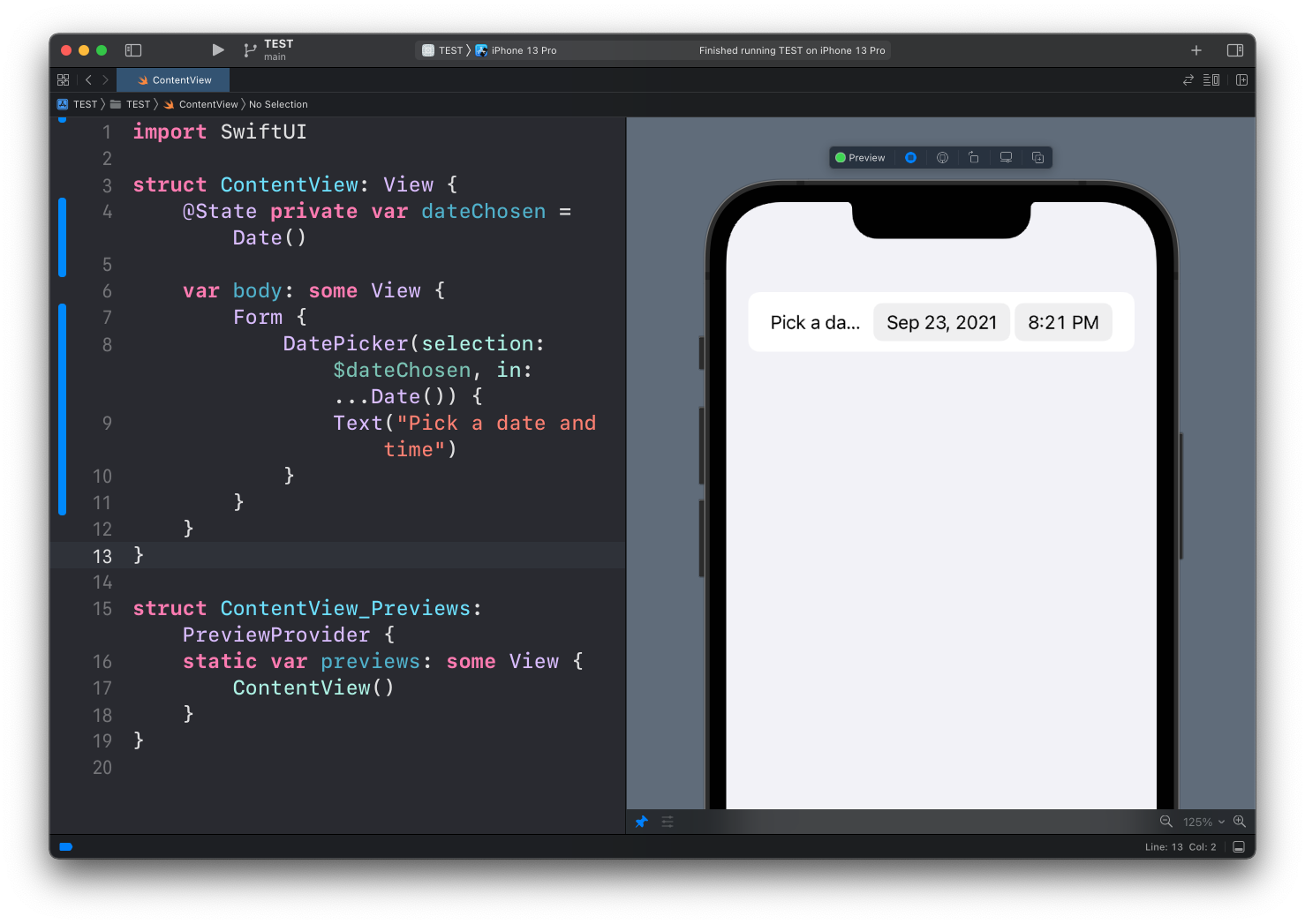
The row shows two pills, one for the date and one for the time. Tapping each one opens its own picker:
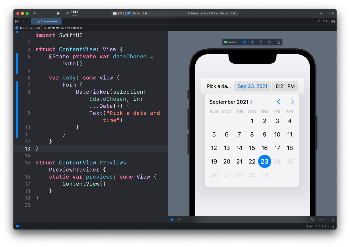
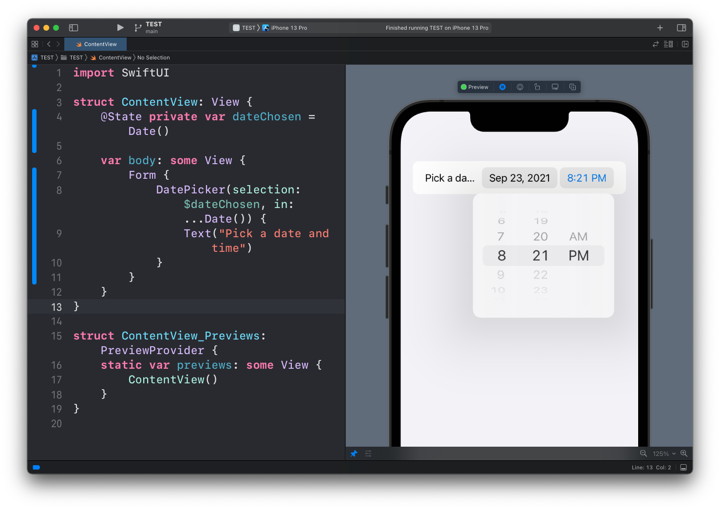
Here’s the full code of the example:
struct ContentView: View {
    @State private var dateChosen = Date()

    var body: some View {
        Form {
            DatePicker(selection: $dateChosen, in: ...Date()) {
                Text("Pick a date and time")
            }
        }
    }
}
Pick a day in the calendar and dateChosen updates. You don’t parse anything. You get a proper Date value you can store, compare, or format.
Showing only the date, or only the time
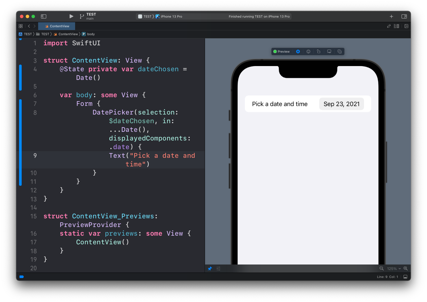
Often you only need one of the two parts. The displayedComponents parameter limits the picker. Here’s just the date:
DatePicker(selection: $dateChosen, in: ...Date(), displayedComponents: .date) {
    Text("Pick a date and time")
}
And just the time:
DatePicker(selection: $dateChosen, in: ...Date(), displayedComponents: .hourAndMinute) {
    Text("Pick a date and time")
}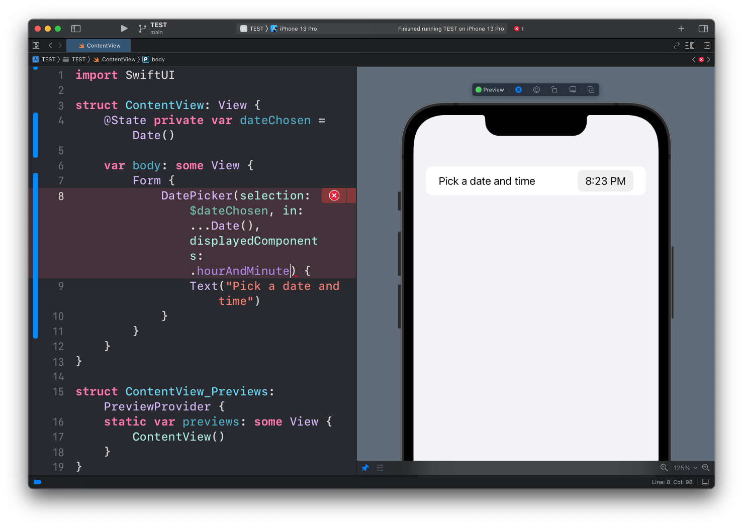
The bound value is still a full Date in both cases. With .date the time part stays whatever it was when the picker started. Keep that in mind when you compare dates later, or you’ll wonder why two “same day” values are not equal.
If you’d rather show the whole calendar inline instead of a tappable pill, add .datePickerStyle(.graphical) to the picker. It takes more room, but it saves a tap when the date is the main thing on the screen.
Lesson completed