Forms and input
SwiftUI forms: TextField
Learn how to use the TextField control in SwiftUI to get text input, bind it to State, configure the keyboard, handle submit, and manage focus.
The first form control we’ll see is the simplest one: TextField.
It shows some text, like the Text view does, but the user can edit it. That’s how we get text input.
Here’s the most basic TextField:
struct ContentView: View {
    @State private var name = ""

    var body: some View {
        Form {
            TextField("", text: $name)
        }
    }
}
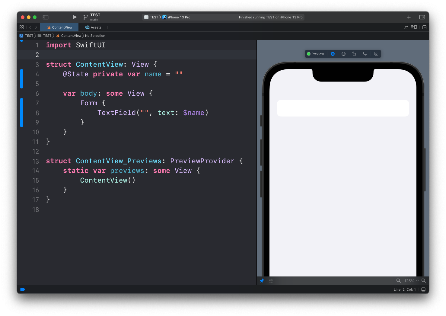
The name property is a SwiftUI property wrapped with @State, so the view can update it. The $ prefix passes a binding: the text field writes into name every time the user types a character.
Run the code. You see an empty text field, and you can tap on it:
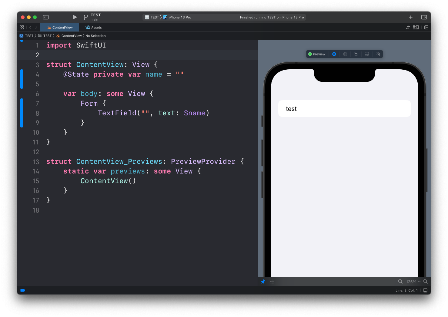
Type something and it shows up in the field:
The first argument of TextField is the placeholder, a string shown when the field is empty. Use it to tell the user what goes in the field:
TextField("Your name", text: $name)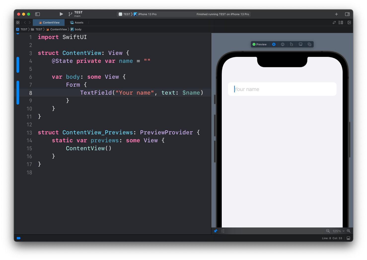
Styling
Inside a Form, the row styling comes for free. Outside of one, a text field has no visible border, which looks odd. Add one with textFieldStyle():
TextField("Your name", text: $name)
    .textFieldStyle(.roundedBorder)
    .padding()
Configuring the keyboard
For specific kinds of input you want the right keyboard, and you want iOS to stop “helping”. An email field is the classic case:
TextField("Email", text: $email)
    .keyboardType(.emailAddress)
    .textInputAutocapitalization(.never)
    .autocorrectionDisabled()
keyboardType(.emailAddress) puts @ and . on the main keyboard. textInputAutocapitalization(.never) stops iOS from capitalizing the first letter. autocorrectionDisabled() keeps autocorrect from mangling addresses.
I add these three lines to every email field. Without them users end up with Flavio@Gmail.com and a red validation error they don’t understand.
Handling submit
When the user presses return, the onSubmit closure runs. You can also change what the return key says with submitLabel():
TextField("Search", text: $query)
    .submitLabel(.search)
    .onSubmit {
        performSearch()
    }
Now the return key reads “Search”, and pressing it calls your function.
Passwords
For sensitive input use SecureField. Same API, but the characters show as dots and the text stays out of screenshots and screen recordings:
SecureField("Password", text: $password)Controlling focus
Sometimes you want the keyboard to appear as soon as a screen shows up, without waiting for a tap. That’s what @FocusState is for:
struct ContentView: View {
    @State private var name = ""
    @FocusState private var isFocused: Bool

    var body: some View {
        Form {
            TextField("Your name", text: $name)
                .focused($isFocused)
        }
        .onAppear {
            isFocused = true
        }
    }
}
Setting isFocused to true in code focuses the field and raises the keyboard. Setting it to false dismisses it. Focus becomes just another piece of state, which fits the rest of SwiftUI nicely.
Lesson completed