Styling HTML Tables with CSS
A brief guide at working with tables in CSS
Tables in the past were greatly overused in CSS, as they were one of the only ways we could create a fancy page layout.
Today with Grid and Flexbox we can move tables back to the job they were intended to do: styling tables.
Let’s start from the HTML. This is a basic table:
<table>
  <thead>
    <tr>
      <th scope="col">Name</th>
      <th scope="col">Age</th>
    </tr>
  </thead>
  <tbody>
    <tr>
      <th scope="row">Flavio</th>
      <td>36</td>
    </tr>
    <tr>
      <th scope="row">Roger</th>
      <td>7</td>
    </tr>
  </tbody>
</table>
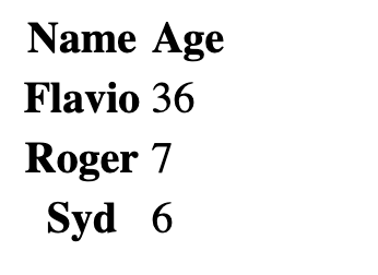
By default it’s not very attractive. The browser provides some standard styles, and that’s it:

We can use CSS to style all the elements of the table, of course.
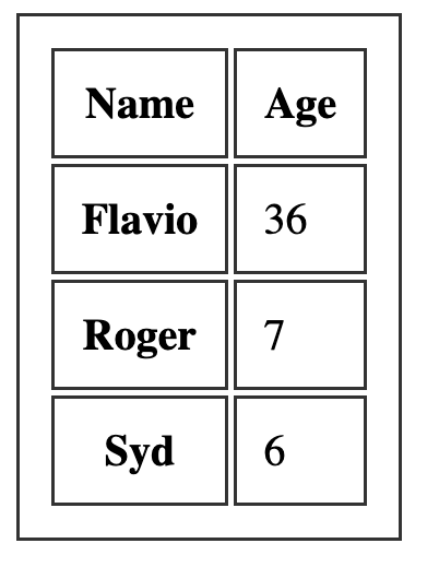
Let’s start with the border. A nice border can go a long way.
We can apply it on the table element, and on the inner elements too, like th and td:
table, th, td {
  border: 1px solid #333;
}
If we pair it with some margin, we get a nice result:

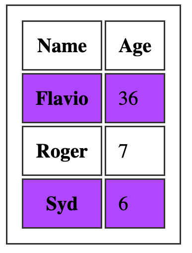
One common thing with tables is the ability to add a color to one row, and a different color to another row. This is possible using the :nth-child(odd) or :nth-child(even) selector:
tbody tr:nth-child(odd) {
  background-color: #af47ff;
}
This gives us:

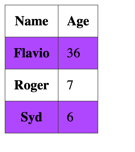
If you add border-collapse: collapse; to the table element, all borders are collapsed into one:

download all my books for free
- javascript handbook
- typescript handbook
- css handbook
- node.js handbook
- astro handbook
- html handbook
- next.js pages router handbook
- alpine.js handbook
- htmx handbook
- react handbook
- sql handbook
- git cheat sheet
- laravel handbook
- express handbook
- swift handbook
- go handbook
- php handbook
- python handbook
- cli handbook
- c handbook
subscribe to my newsletter to get them
Terms: by subscribing to the newsletter you agree the following terms and conditions and privacy policy. The aim of the newsletter is to keep you up to date about new tutorials, new book releases or courses organized by Flavio. If you wish to unsubscribe from the newsletter, you can click the unsubscribe link that's present at the bottom of each email, anytime. I will not communicate/spread/publish or otherwise give away your address. Your email address is the only personal information collected, and it's only collected for the primary purpose of keeping you informed through the newsletter. It's stored in a secure server based in the EU. You can contact Flavio by emailing flavio@flaviocopes.com. These terms and conditions are governed by the laws in force in Italy and you unconditionally submit to the jurisdiction of the courts of Italy.