CSS Border inside the element
By Flavio Copes
Learn how to draw a CSS border inside an element instead of outside it, using box-shadow with the inset keyword so the box size never shifts on hover.
You can draw a border inside an element, without changing its size, using box-shadow with the inset keyword. Here’s how I got there.
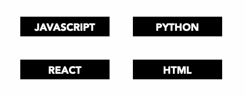
I had a list of boxes, and on hover I wanted to invert the colors;
div {
  background-color: #000;
  color: #fff;
}
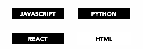
So I went on and added
div:hover {
  background-color: #fff;
  color: #000;
}
But then.. the box didn’t look “as a box”. So I added a border:
div:hover {
  background-color: #fff;
  color: #000;
  border: 4px solid #000;
}
but it looked weird because of course the border is added outside the box.
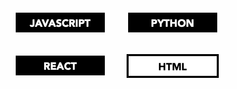
This is the default CSS box model at work. A border adds to the rendered size of the element, so a border that appears only on hover makes the box grow by 4 pixels on each side. Everything around it shifts, and the layout jumps.
The box-shadow trick
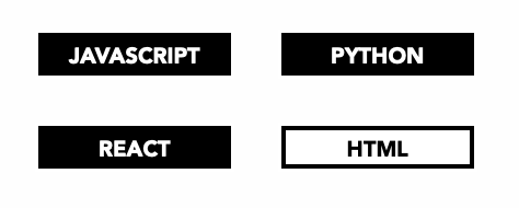
The best way I found was to use the box-shadow property in this way:
div:hover {
  background-color: #fff;
  color: #000;
  box-shadow: inset 0px 0px 0px 4px #000;
}
The inset keyword draws the shadow inside the element instead of behind it. With zero offsets, zero blur, and a 4px spread, the “shadow” is a solid 4px ring hugging the inner edge. It looks exactly like a border.
The nice part: shadows don’t participate in layout. The element keeps the same size whether the shadow is there or not, so nothing moves on hover.
Here’s the result:
Another option: a transparent border
You can also reserve the space upfront, with a transparent border in the normal state:
div {
  border: 4px solid transparent;
}

div:hover {
  border-color: #000;
}
This works too. The size never changes because the border is always there, just invisible. I prefer the box-shadow version because it doesn’t touch the base styles at all.
One thing to know about the inset shadow: it’s painted below the element’s content. If the box contains an image that touches the edges, the image covers your fake border. With text and some padding, like my boxes, it’s not a problem.
If you want to tweak box-shadow values visually, try my free shadow and radius generator.
Want me to talk about your product? You can sponsor this site.