The Flexbox Tutorial
By Flavio Copes
Learn CSS Flexbox using the main and cross axes, then control direction, alignment, wrapping, gaps, ordering, and how individual items grow or shrink.
What is Flexbox?
Flexbox is a one-dimensional CSS layout model.
It lays out items along one main axis: a row or a column. CSS Grid is usually a better fit when you need to control rows and columns together.
Flexbox is useful for navigation bars, groups of controls, card rows, centering, and other layouts where items share one direction.
Try the properties in my flexbox playground as you read.
The CSS Flexible Box Layout specification defines the layout model.
Enable Flexbox
Set display: flex on the parent:
.container {
  display: flex;
}
Its direct children become flex items.
Use inline-flex when the flex container itself should behave like an inline-level element:
.container {
  display: inline-flex;
}
Understand the two axes
Flexbox uses a main axis and a cross axis.
flex-direction chooses the main axis. The cross axis runs perpendicular to it.
This terminology matters because the axes are not always horizontal and vertical. They also depend on the document’s writing mode and text direction.
justify-contentaligns items on the main axisalign-itemsaligns items on the cross axis
Container properties
Container properties define how all its flex items participate in the layout.
The main ones are:
flex-directionjustify-contentalign-itemsalign-contentflex-wrapflex-flowgap
Choose a direction
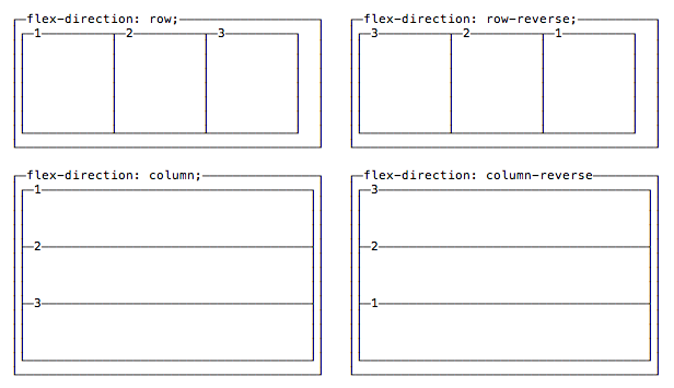
flex-direction sets the main axis:
rowfollows the inline text directionrow-reversefollows it in reversecolumnfollows the block directioncolumn-reversefollows it in reverse
.container {
  display: flex;
  flex-direction: row;
}
row is the default.
Align items on the main axis
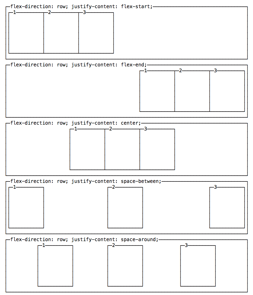
justify-content distributes free space along the main axis.
Common values are:
flex-startflex-endcenterspace-betweenspace-aroundspace-evenly
.container {
  display: flex;
  justify-content: space-between;
}
If flex-direction is row, this usually changes horizontal distribution. If it is column, it usually changes vertical distribution.
Align items on the cross axis
align-items sets the default alignment for items within a flex line.
Common values are:
stretchflex-startflex-endcenterbaseline
.container {
  display: flex;
  align-items: center;
}
stretch is the default. It only stretches an item when its cross size is auto.
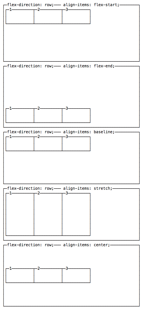
baseline aligns items using their text baselines. This becomes easier to see when items use different font sizes.
For a wrapped container, align-content distributes the flex lines on the cross axis. It has no effect when there is only one line.
.container {
  display: flex;
  flex-wrap: wrap;
  align-content: space-between;
}
Wrap items onto multiple lines
Flex items stay on one line by default:
.container {
  flex-wrap: nowrap;
}
Allow them to create more lines with wrap:
.container {
  display: flex;
  flex-wrap: wrap;
}
wrap-reverse reverses the cross-start and cross-end directions. It does not reverse the order of items within each line.
The flex-flow shorthand combines direction and wrapping:
.container {
  display: flex;
  flex-flow: row wrap;
}
Add gaps
Use gap to add consistent space between flex items:
.container {
  display: flex;
  gap: 1rem;
}
You can set row and column gaps separately:
.container {
  row-gap: 1rem;
  column-gap: 2rem;
}
Flex item properties
These properties apply to individual flex items:
orderalign-selfflex-growflex-shrinkflex-basisflex
Change visual order
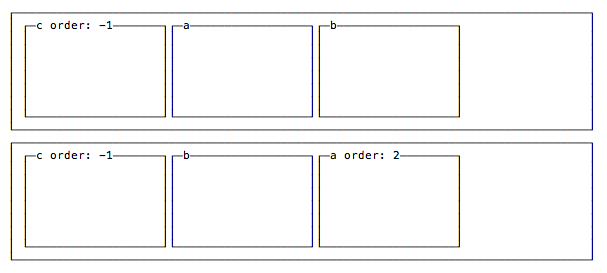
Every item starts with order: 0. Lower values appear first:
.featured {
  order: -1;
}
Be careful with order. It changes the visual order, not the source or keyboard navigation order.
Keep the HTML order logical and accessible. Use order for small visual adjustments, not to repair incorrect markup.
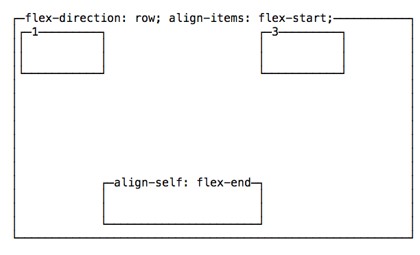
Override cross-axis alignment
An item can override the container’s align-items value with align-self:
.featured {
  align-self: flex-end;
}
It accepts the same common alignment values as align-items, plus auto.
Grow and shrink items
flex-basis sets an item’s initial main size before free space is distributed:
.item {
  flex-basis: 12rem;
}
auto uses the item’s main-size property when provided, or its content size otherwise.
flex-grow controls how positive free space is shared. The default is 0:
.item {
  flex-grow: 1;
}
An item with flex-grow: 2 receives twice the share of free space given to an item with flex-grow: 1. This does not mean its final width is always twice as large.
flex-shrink controls how items shrink when there is not enough space. The default is 1:
.fixed {
  flex-shrink: 0;
}
The browser considers both flex-shrink and the item’s flex base size. A shrink factor of 2 does not mean the final item becomes half the size.
Long content can still prevent an item from shrinking because flex items have an automatic minimum size. Set min-width: 0 when a row item needs to shrink below its content’s minimum width:
.item {
  min-width: 0;
}
Use the flex shorthand
The flex shorthand combines:
flex-growflex-shrinkflex-basis
The initial value is:
.item {
  flex: 0 1 auto;
}
A common equal-width layout uses:
.item {
  flex: 1;
}
Use the shorthand when you set flexibility. It resets all three parts together and makes the intended behavior clearer.
See the MDN Flexbox guide for more examples and browser-focused details.
Want me to talk about your product? You can sponsor this site.