The CSS position property
How to work with the `position` property in CSS
Positioning is what makes us determine where elements appear on the screen, and how they appear.
You can move elements around, and position them exactly where you want.
In this post I’ll also see how things change on a page based on how elements with different position interact with each other.
We have one main CSS property: position.
It can have those 5 values:
staticrelativeabsolutefixedsticky
Static positioning
This is the default value for an element. Static positioned elements are displayed in the normal page flow.
Relative positioning
If you set position: relative on an element, you are now able to position it with an offset, using the properties
- top
- right
- bottom
- left
which are called offset properties. They accept a length value or a percentage.
Take this example I made on Codepen. I create a parent container, a child container, and an inner box with some text:
<div class="parent">
  <div class="child">
    <div class="box">
      <p>Test</p>
    </div>
  </div>
</div>
with some CSS to give some colors and padding, but does not affect positioning:
.parent {
  background-color: #af47ff;
  padding: 30px;
  width: 300px;
}

.child {
  background-color: #ff4797;
  padding: 30px;
}

.box {
  background-color: #f3ff47;
  padding: 30px;
  border: 2px dotted #333;
  font-family: courier;
  text-align: center;
  font-size: 2rem;
}
here’s the result:
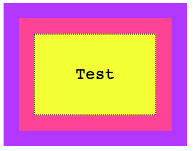
You can try and add any of the properties I mentioned before (top, right, bottom, left) to .box, and nothing will happen. The position is static.
Now if we set position: relative to the box, at first apparently nothing changes. But the element is now able to move using the top, right, bottom, left properties, and now you can alter the position of it relatively to the element containing it.
For example:
.box {
  /* ... */
  position: relative;
  top: -60px;
}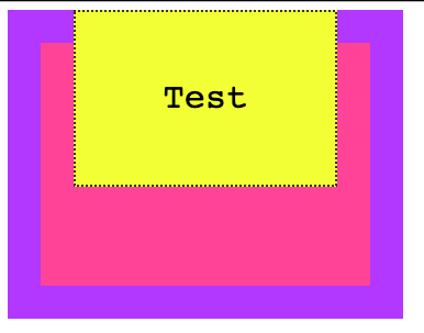
A negative value for top will make the box move up relatively to its container.
Or
.box {
  /* ... */
  position: relative;
  top: -60px;
  left: 180px;
}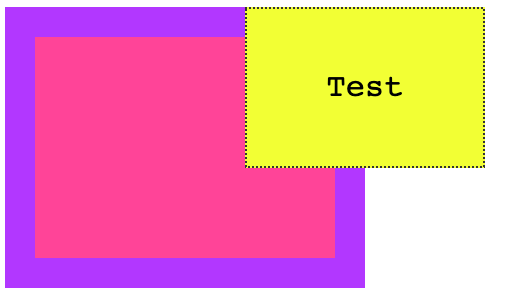
Notice how the space that is occupied by the box remains preserved in the container, like it was still in its place.
Another property that will now work is z-index to alter the z-axis placement. We’ll talk about it later on.
Absolute positioning
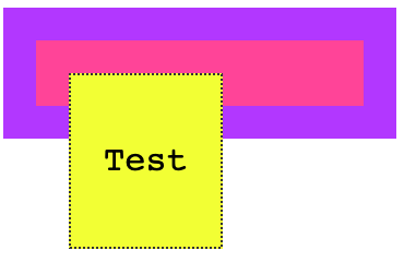
Setting position: absolute on an element will remove it from the document’s flow, and it will not longer follow the original page positioning flow.
Remember in relative positioning that we noticed the space originally occupied by an element was preserved even if it was moved around?
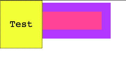
With absolute positioning, as soon as we set position: absolute on .box, its original space is now collapsed, and only the origin (x, y coordinates) remain the same.
.box {
  /* ... */
  position: absolute;
}
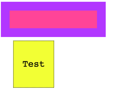
We can now move the box around as we please, using the top, right, bottom, left properties:
.box {
  /* ... */
  position: absolute;
  top: 0px;
  left: 0px;
}
or
.box {
  /* ... */
  position: absolute;
  top: 140px;
  left: 50px;
}
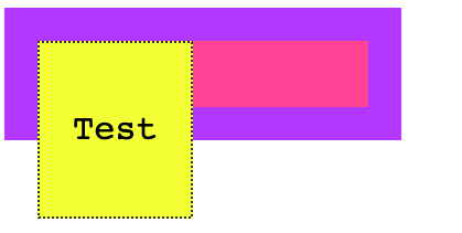
The coordinates are relative to the closest container that is not static.
This means that if we add position: relative to the .child element, and we set top and left to 0, the box will not be positioned at the top left margin of the window, but rather it will be positioned at the 0, 0 coordinates of .child:
.child {
  /* ... */
  position: relative;
}

.box {
  /* ... */
  position: absolute;
  top: 0px;
  left: 0px;
}
Here’s what happens if .child is static (the default):
.child {
  /* ... */
  position: static;
}

.box {
  /* ... */
  position: absolute;
  top: 0px;
  left: 0px;
}
Like for relative positioning, you can use z-index to alter the z-axis placement.
Fixed positioning
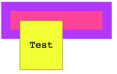
Like with absolute positioning, when an element is assigned position: fixed it’s removed from the flow of the page.
The difference with absolute positioning is this: elements are now always positioned relative to the window, instead of the first non-static container.
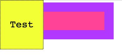
.box {
  /* ... */
  position: fixed;
}
.box {
  /* ... */
  position: fixed;
  top: 0;
  left: 0;
}
Another big difference is that elements are not affected by scrolling. Once you put a sticky element somewhere, scrolling the page does not remove it from the visible part of the page.
Sticky positioning
While the above values have been around for a very long time, this one was introduced recently and it’s still relatively unsupported (see caniuse.com)
The UITableView iOS component is the thing that comes to mind when I think about position: sticky. You know when you scroll in the contacts list and the first letter is sticked to the top, to let you know you are viewing that particular letter’s contacts?
We used JavaScript to emulate that, but this is the approach taken by CSS to allow it natively.
download all my books for free
- javascript handbook
- typescript handbook
- css handbook
- node.js handbook
- astro handbook
- html handbook
- next.js pages router handbook
- alpine.js handbook
- htmx handbook
- react handbook
- sql handbook
- git cheat sheet
- laravel handbook
- express handbook
- swift handbook
- go handbook
- php handbook
- python handbook
- cli handbook
- c handbook
subscribe to my newsletter to get them
Terms: by subscribing to the newsletter you agree the following terms and conditions and privacy policy. The aim of the newsletter is to keep you up to date about new tutorials, new book releases or courses organized by Flavio. If you wish to unsubscribe from the newsletter, you can click the unsubscribe link that's present at the bottom of each email, anytime. I will not communicate/spread/publish or otherwise give away your address. Your email address is the only personal information collected, and it's only collected for the primary purpose of keeping you informed through the newsletter. It's stored in a secure server based in the EU. You can contact Flavio by emailing flavio@flaviocopes.com. These terms and conditions are governed by the laws in force in Italy and you unconditionally submit to the jurisdiction of the courts of Italy.