SwiftUI: stacks and groups
By Flavio Copes
Learn how to lay out multiple views in SwiftUI using HStack, VStack, and ZStack to align them on each axis, plus Group to bundle views together.
No SwiftUI app, beside an Hello World, has just a view.
When you want to add more than one view, you need to add them to a stack.
There are 3 kinds of stacks:
HStackaligns items on the X axisVStackaligns items on the Y axisZStackaligns items on the Z axis
Let’s go back to the Hello World app:
import SwiftUI

struct ContentView: View {
  var body: some View {
    Text("Hello World")
  }
}
To add a second Text view we can’t do this:
struct ContentView: View {
  var body: some View {
    Text("Hello World")
    Text("Hello again!")
  }
}
but we have to embed those views into a stack.
Let’s try with VStack:
struct ContentView: View {
  var body: some View {
    VStack {
      Text("Hello World")
      Text("Hello again!")
    }
  }
}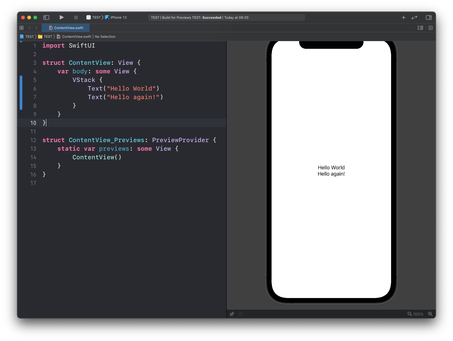
See? The views are aligned vertically, one after the other.
Here’s HStack:
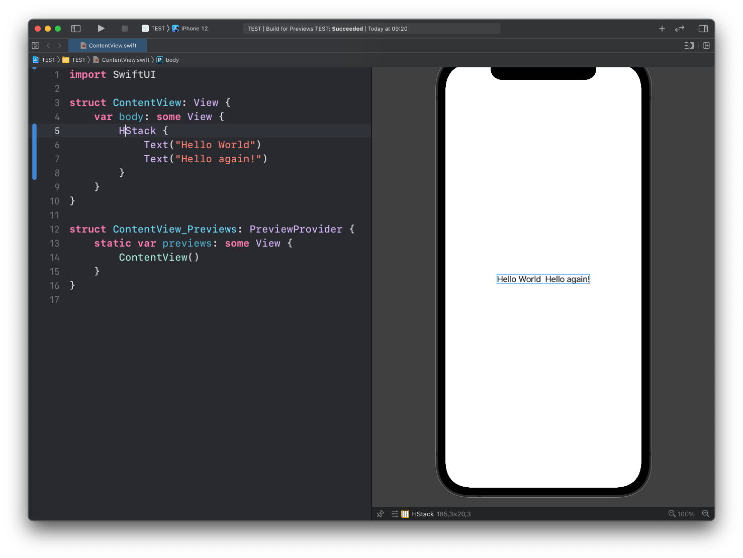
And here’s ZStack, which puts items one in front of the other, and in this case generates a mess:
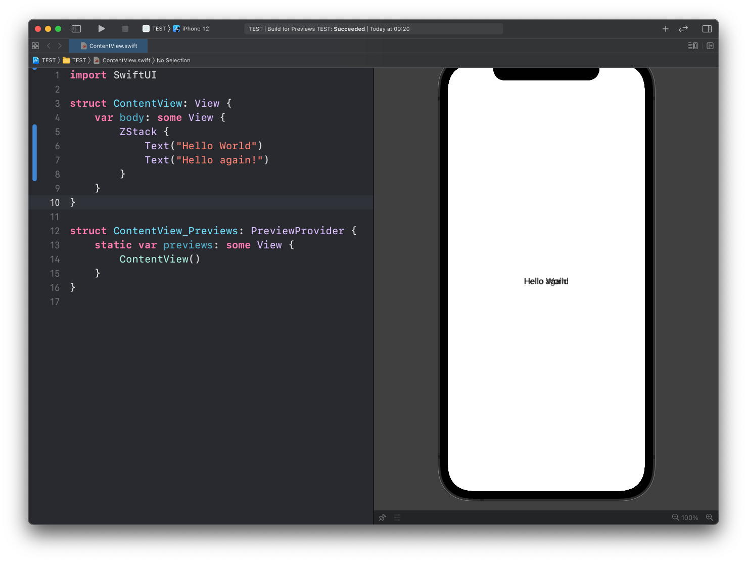
ZStack puts the views one on top of the other. The first child ends up at the back, the last one in front.
The classic use case is a background image with some text over it:
ZStack {
  Image("Avatar")
    .resizable()
    .scaledToFill()
  Text("Flavio")
    .font(.title)
    .foregroundStyle(.white)
    .padding(8)
    .background(.black.opacity(0.6))
}
.frame(width: 200, height: 200)
.clipped()
The image fills the 200 by 200 frame and the label is drawn over it, centered. Use ZStack when views share the same space, VStack and HStack when they sit next to each other.
In SwiftUI we organize all our UI using those 3 stacks.
Spacing and alignment
Stacks accept two parameters, spacing and alignment.
spacing is the gap between the children, in points. Without it, SwiftUI picks a default that depends on the platform:
VStack(spacing: 24) {
  Text("Hello World")
  Text("Hello again!")
}
alignment controls how the children line up on the other axis. In a VStack that means left, center or right (.leading, .center, .trailing). In an HStack it means top, center or bottom:
VStack(alignment: .leading, spacing: 8) {
  Text("Profile")
    .font(.headline)
  Text("flaviocopes.com")
    .font(.subheadline)
    .foregroundStyle(.secondary)
}
Both texts start at the left edge. The default is .center, and with texts of different lengths that looks odd.
Nested stacks
Real screens mix stacks. An HStack inside a VStack is how you build a row with an icon and some text next to it:
VStack(alignment: .leading, spacing: 12) {
  Text("Today")
    .font(.title2)

  HStack(spacing: 12) {
    Image(systemName: "sun.max.fill")
      .font(.largeTitle)
      .foregroundStyle(.orange)
    VStack(alignment: .leading) {
      Text("Sunny")
      Text("24°C")
        .foregroundStyle(.secondary)
    }
  }
}
.padding()
The outer VStack puts the heading above the weather row. The inner HStack puts the icon beside the two texts, which are in a VStack of their own. When a nested block starts to grow, move it to its own view.
Spacer
Spacer takes up all the free space in a stack. Put one between two views and it pushes them apart:
HStack {
  Text("Status")
  Spacer()
  Text("Online")
    .foregroundStyle(.green)
}
.padding()
“Status” goes to the left edge, “Online” to the right. Without the Spacer, the two texts would sit next to each other in the center.
If you add more than one Spacer, they share the free space equally. That’s how you center something, one Spacer on each side. When the gap has to be the same on every screen size, use a fixed spacing value instead.
Group
We also use Group, a view that, similarly to stacks, can be used to group together multiple views, but contrary to stack views, it does not affect layout.
VStack {
  Group {
    Text("Hello World")
    Text("Hello again!")
  }
}
Group is useful to apply one modifier to several views at once, as we’ll see below, and to keep related views together. It adds no layout of its own.
When I first wrote this post, a view could have at most 10 children, and
Groupwas the way around that limit. Since Xcode 15 (Swift 5.9) the limit is gone:ViewBuilderuses parameter packs, so a stack can have as many direct children as you want. Today you useGroupfor the shared modifiers, not for the count.
Lazy stacks
A VStack creates all its children right away. With 200 rows inside a ScrollView that’s wasted work, because most of them are off screen. LazyVStack and LazyHStack create the children only when they are about to become visible:
ScrollView {
  LazyVStack(alignment: .leading, spacing: 12) {
    ForEach(1...200, id: \.self) { number in
      Text("Row \(number)")
        .padding(.horizontal)
    }
  }
}
Use a plain VStack for short, fixed layouts. Use LazyVStack for a long scrolling list of rows, when you don’t need what List gives you, like swipe actions or selection.
Environment modifiers
Group and the stack views are views too, and so they have modifiers.
Sometimes modifiers affect the view they are applied to, like in this case:
Text("Hello World")
  .font(.largeTitle)
Sometimes however they are used to apply the same property to multiple views at the same time.
Like this:
VStack {
  Text("Hello World")
  Text("Hello again!")
}
.font(.largeTitle)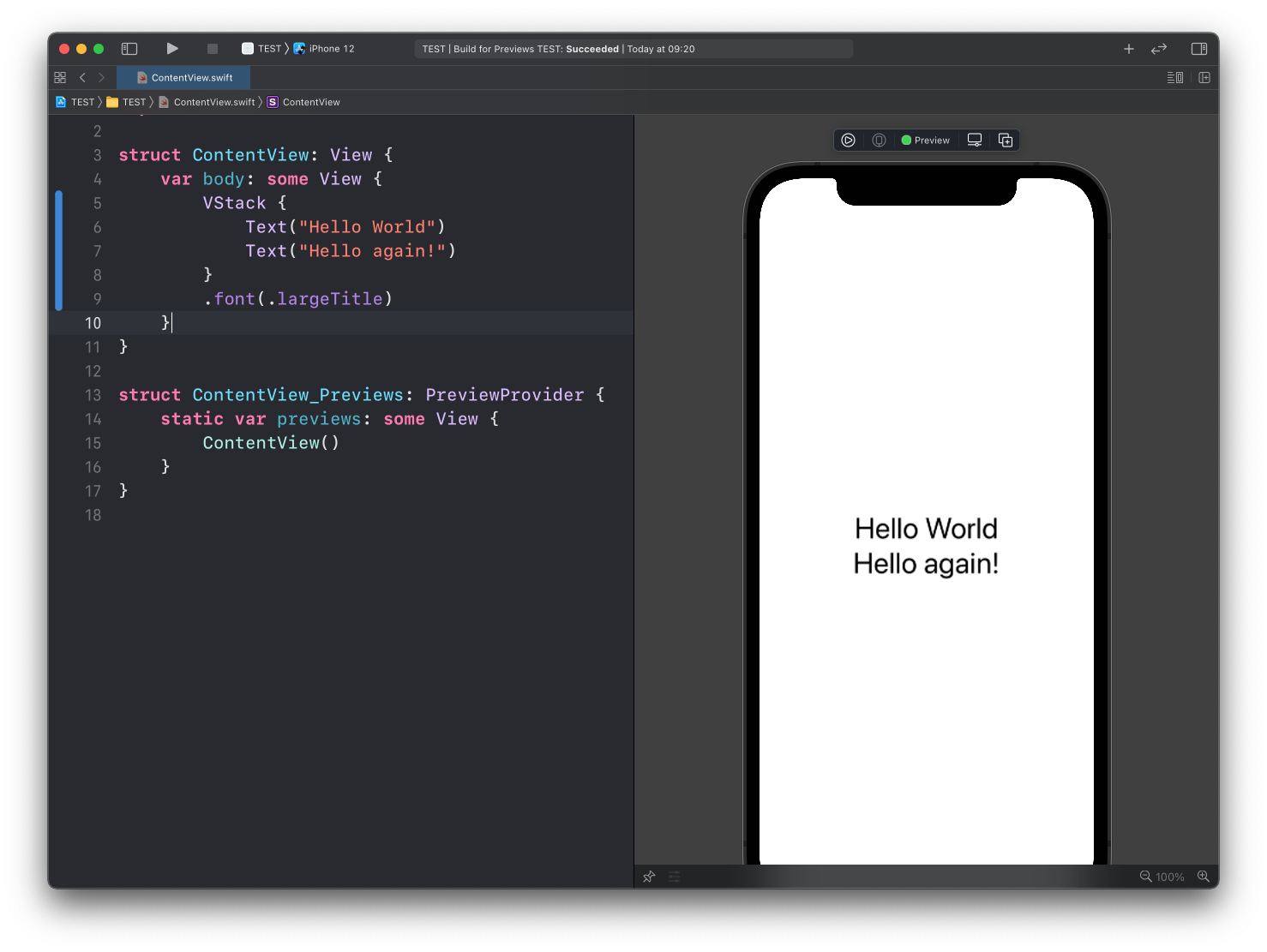
See? By applying the font() modifier to the VStack, the .largeTitle font was applied to both Text views.
This is valid for modifiers that we call environment modifiers. Not every modifier can work this way, but some do, like in the above example.
Want me to talk about your product? You can sponsor this site.
Related posts about swift: