SwiftUI: the Button view and updating the app state
By Flavio Copes
Learn how to use the Button view in SwiftUI to run an action when tapped, and why you need the @State property wrapper to update your app's state.
The Button view can be used to display an interactive button element.
We can declare it in this way:
Button("Button label") {
    //this happens when it's tapped
}
Or in this way:
Button {
   //this happens when it's tapped
} label: {
   Text("Button label")
}
This second way is more common when you have something else as the label of the button, not text. For example an image.
Let’s use the first way in a SwiftUI program:
struct ContentView: View {
    var body: some View {
        Button("Test") {

        }
        .font(.title)
    }
}
See? There is a blue text in the app, and you can tap it. It’s interactive.
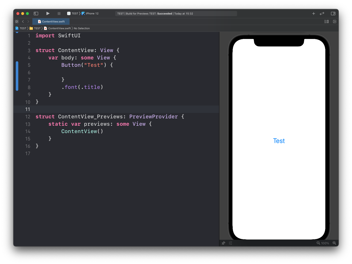
We haven’t told it to do anything when tapped, so it does anything.
We can print something to the debugging console:
struct ContentView: View {
    var body: some View {
        Button("Test") {
            print("test")
        }
        .font(.title)
    }
}
Note that this works only when you run the app, not in the Xcode preview
Now we can add another step to our app. We’ll print a property value inside the button label:
struct ContentView: View {
    var count = 0

    var body: some View {
        Button("Count: \(count)") {

        }
        .font(.title)
    }
}
And when it’s clicked we increment the count:
struct ContentView: View {
    var count = 0

    var body: some View {
        Button("Count: \(count)") {
            self.count += 1
        }
        .font(.title)
    }
}
But the app will not compile, with the error
Left side of mutating operator isn't mutable: 'self' is immutable❌
We need to use the @State property wrapper before we declare the property:
struct ContentView: View {
    @State var count = 0

    var body: some View {
        Button("Count: \(count)") {
            self.count += 1
        }
        .font(.title)
    }
}
The app will now work and we can click the label to increment the count property value:
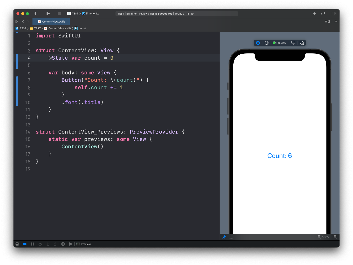
Of course the counter will start from 0 the next time we run it, because we are not persisting the state in any way. We’ll get to that later.
Button styles
The plain blue text you saw in the screenshots is the default style. If you want a filled or bordered button, you don’t need to draw anything yourself. Pass one of the system styles to .buttonStyle():
Button("Save") {
    save()
}
.buttonStyle(.borderedProminent)

Button("Cancel") {
    cancel()
}
.buttonStyle(.bordered)

Button("More info") {
    showInfo()
}
.buttonStyle(.plain)
Use .borderedProminent for the main action of a screen and .bordered for the secondary ones. .plain shows just the label, with no button look at all, which is handy inside a List where you don’t want every row to look like a button.
The filled style uses the app accent color. Change it with .tint:
Button("Continue") {
    goNext()
}
.buttonStyle(.borderedProminent)
.tint(.orange)Destructive buttons
When the button deletes something, pass role: .destructive. SwiftUI then shows it in red, and in alerts and menus it gets the destructive treatment automatically:
Button("Delete account", role: .destructive) {
    deleteAccount()
}
Glass styles on iOS 26
iOS 26 added two Liquid Glass button styles, .glass and .glassProminent. They only exist on iOS 26 and later, so if your app still supports older versions you have to check with #available before using them.
You can’t put an #available check in the middle of a modifier chain, so wrap it in a small ViewModifier and apply that instead:
Button("Continue") {
    goNext()
}
.modifier(ProminentButtonStyle())
Here’s the modifier. It picks the glass style when the OS has it, and falls back to .borderedProminent everywhere else:
struct ProminentButtonStyle: ViewModifier {
    func body(content: Content) -> some View {
        if #available(iOS 26.0, *) {
            content.buttonStyle(.glassProminent)
        } else {
            content.buttonStyle(.borderedProminent)
        }
    }
}
None of these styles change how the button works. The action closure and the @State property are what make the counter update. I go deeper into @State and the other property wrappers in a separate post.
Want me to talk about your product? You can sponsor this site.
Related posts about swift: