# React, how to make responsive JSX
> Learn how to make responsive JSX in React using the react-responsive package and its useMediaQuery hook to detect screen size and render different layouts.
Author: [Flavio Copes](https://flaviocopes.com/about/) | Published: 2021-07-12 | Topics: [React](https://flaviocopes.com/tags/react/) | Canonical: https://flaviocopes.com/react-responsive-jsx/
I had the need to make a sidebar look in one particular way when in a big screen in [React](https://flaviocopes.com/react/), and in another way when in a smaller screen, so I wanted to have some way to detect responsive layouts changes in [JSX](https://flaviocopes.com/jsx/).
Like this:
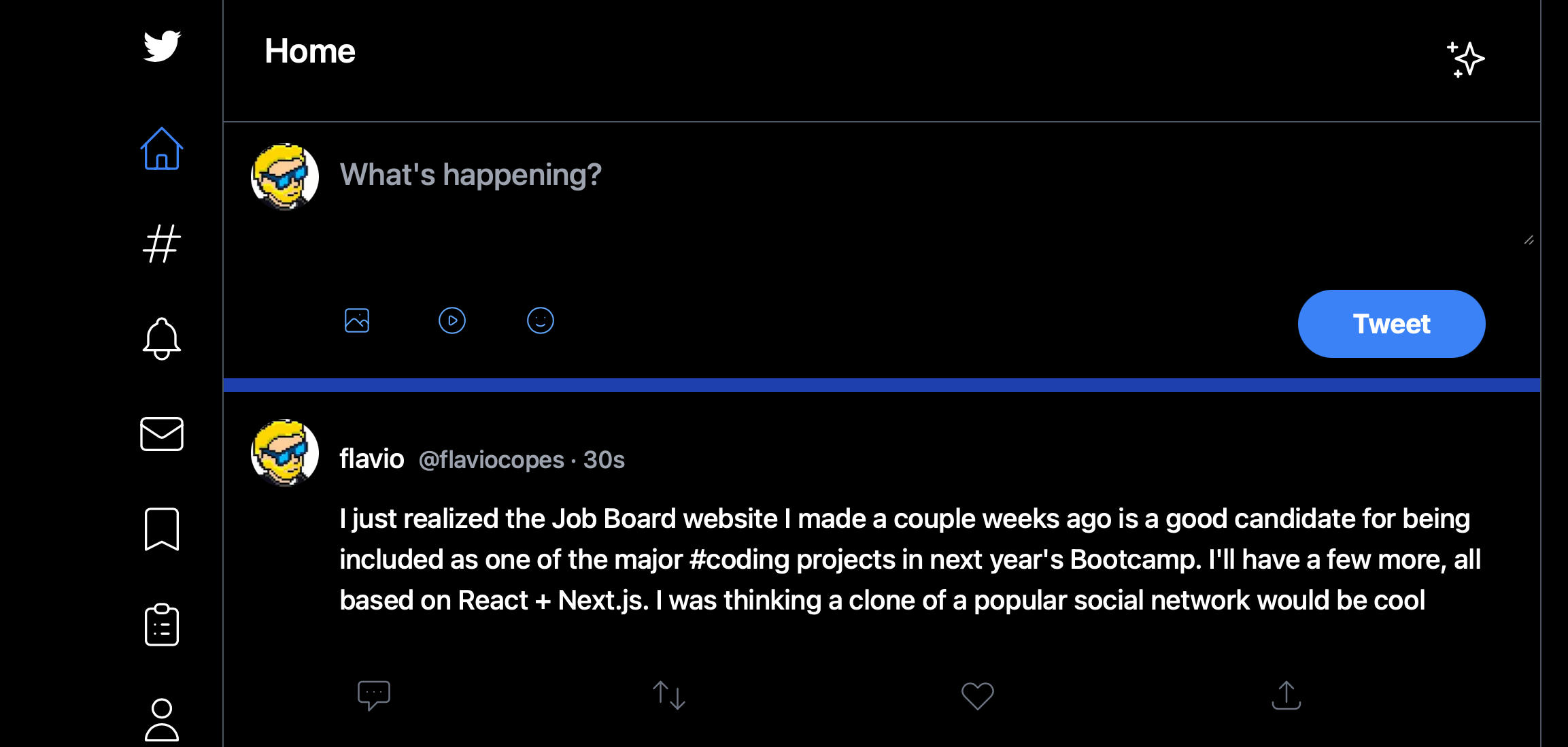
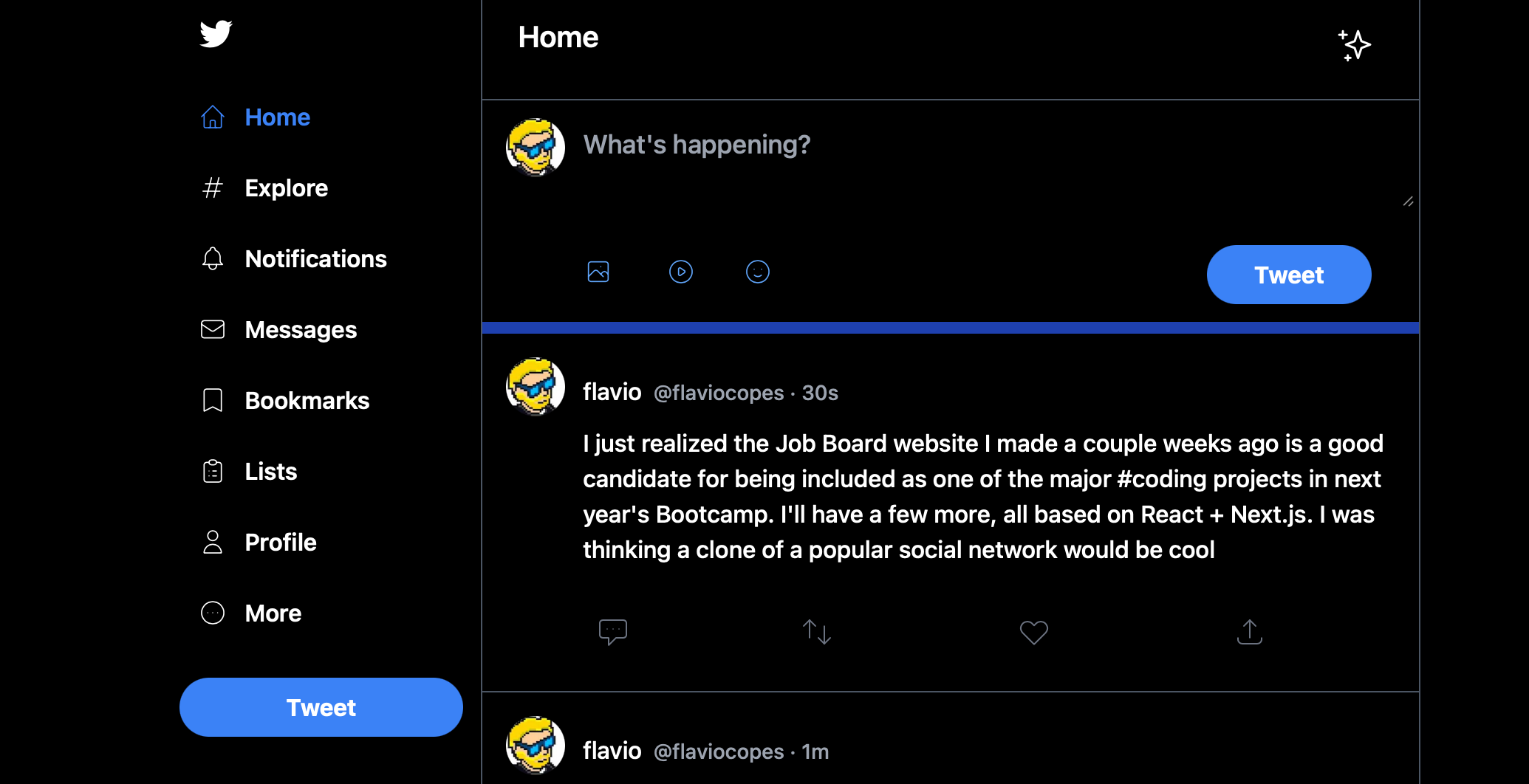
You can use the [`react-responsive`](https://www.npmjs.com/package/react-responsive) package to do that.
```
npm install react-responsive
```
then you can import the `useMediaQuery` hook:
```js
import { useMediaQuery } from 'react-responsive'
```
And in your components you can use it like this:
```jsx
const isBigScreen = useMediaQuery({ query: '(min-device-width: 1224px)' })
const isSmallScreen = useMediaQuery({ query: '(max-width: 1224px)' })
```
This is a simple example of breakpoints I found on the component's home page, and they worked fine for my needs.
I used it in a layout component in this way:
```jsx
import { useMediaQuery } from 'react-responsive'
export default function Layout({ children }) {
const isBigScreen = useMediaQuery({ query: '(min-device-width: 1224px)' })
const isSmallScreen = useMediaQuery({ query: '(max-width: 1224px)' })
return (
{isSmallScreen ? (
) : (
)}
)
}
```
I used it to pass a `small` prop to a `LeftSidebar` component, so it knew how to render itself.
You can also do things differently and create components to wrap JSX, which I find nicer to see:
```jsx
import { useMediaQuery } from 'react-responsive'
const BigScreen = ({ children }) => {
return useMediaQuery({ minWidth: 992 }) ? children : null
}
const SmallScreen = ({ children }) => {
return useMediaQuery({ maxWidth: 991 }) ? children : null
}
export default function Layout({ children }) {
return (
)
}
```